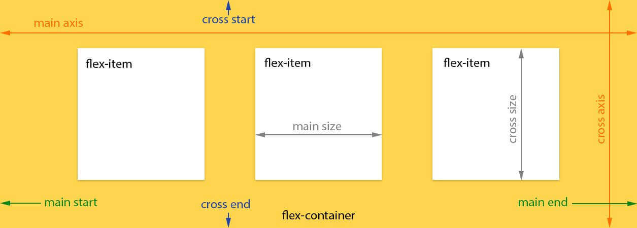
Flex 布局笔记
关于 Flex 布局,总结自阮一峰博客。
Read more
Advanced Styling with Responsive Design
Advanced Styling with Responsive Design此笔记为Coursera同名课程笔记。 Week1什么是响应式设计?响应式设计: It is designing your sites with multiple screen sizes/resolutions in mind. Sites should “work” under any platform, any browser size, any orientation.The user should have the power. 需要考虑的概念 Concepts to consider Media queries - decting the viewport size 检测 Flexible grid-based ..
Read moreCSS学习记录
此博客用于记录常用但又不太熟悉的 CSS 相关知识,会持续更新。
Read more